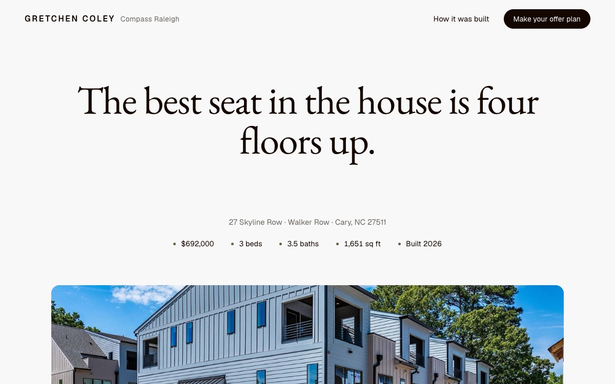
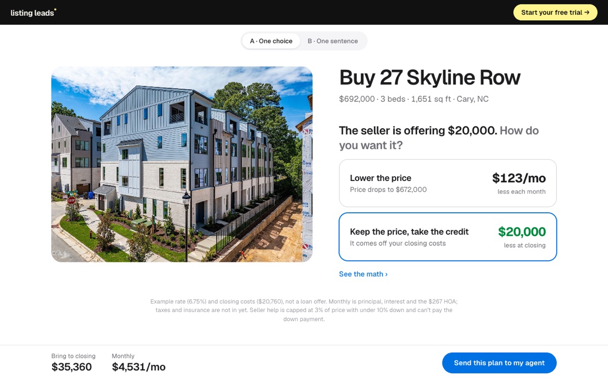
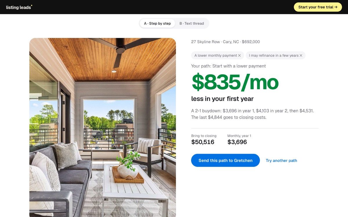
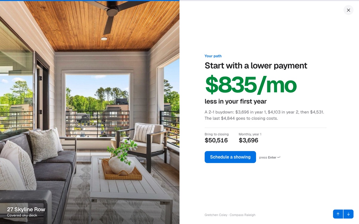
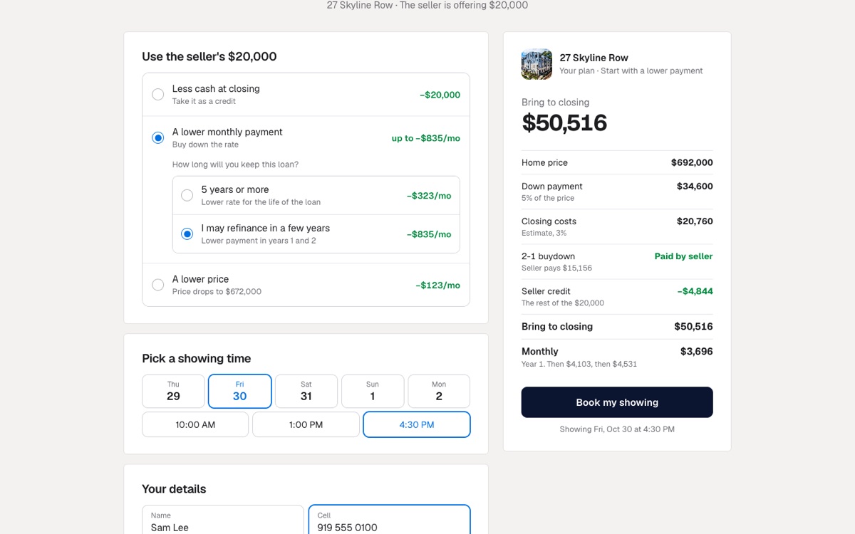
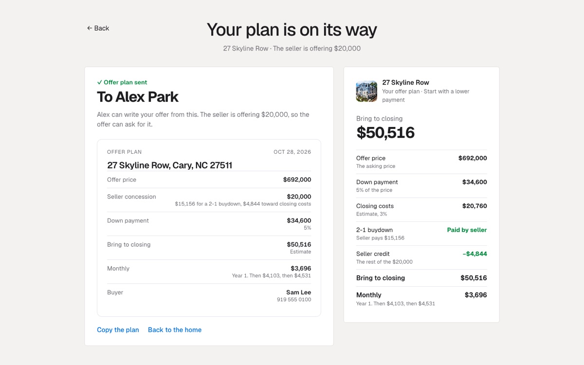
Instead of cutting the price, the seller offers $20,000. The buyer sees the home, picks where the money helps most, and sends an offer plan to their agent.
Copy this into Claude, fill in the blanks, and you get your own version. It is the same brief that built this one.
( The prompt )
You are a senior designer, a front-end engineer and a mortgage-savvy listing agent. Build me a listing page for one real home where the seller is offering money toward the buyer's purchase instead of cutting the price. The page sells the home first, then turns the seller's offer into an offer plan the buyer sends to their agent.

THE HOME
- Address, price, beds, baths, square feet, HOA and year built: [your listing]
- 10 to 20 listing photos with a name for each: [your photos]
- What the seller is offering: [$ amount], plus my name and brokerage

THE PAGE
- One calm headline about what makes this home special, centered, in a light serif. The facts in one small line under it.
- One big rounded photo that grows to full width as you scroll. Tap it for a full-screen photo viewer with every photo.
- The home floor by floor, as thin-line rows: a short title on the left, the real features on the right. Hovering a row shows that floor's photo beside the mouse.
- A dark section: "The seller is offering [$]. Put it where it helps you most." with photo cards at different heights. Each card shows one way to use the money as a big number, and opens the plan with that way already picked.
- The neighborhood: parks and schools with real distances, beside a slow photo slider.

THE OFFER PLAN (a checkout, full screen)
- Left: three short sections. "Use the seller's [$]": less cash at closing (a credit), a lower monthly payment (if they keep the loan 5 years or more, buy the rate down for good; if they may refinance, a 2-1 buydown), or a lower price. Each row shows what it saves.
- If they pick the lower price, tell them the truth in one line: the same money as a rate buydown saves more each month.
- "Who should get your plan?": my buyer's agent (name and email or cell), or "I don't have an agent yet", which sends it to me.
- Their name and cell, then one button.
- Right: a dark summary card with the offer price, down payment, closing costs, the seller's help, and two totals that update on every pick: bring to closing, and monthly.
- After they send it, show a clean offer plan their agent can use: offer price, seller concession and how it is used, down payment, cash to close, monthly and buyer. Add a copy button.

THE MATH
- 30-year loan, [down payment %] down, an example rate, closing costs as an estimate. Monthly includes the HOA.
- A rate buydown: about 0.25% off the rate for each 1% of the loan, labeled as an estimate.
- A 2-1 buydown costs 12 months of the payment difference at 2% lower plus 12 months at 1% lower. Any money left goes to closing costs.
- Seller help can't pay the down payment and is capped by the loan rules. Say so in the footnote.

THE LOOK
- Off-white page, dark brown ink, one olive section, no bright colors. A light serif for big lines and a clean sans for the rest. Rounded photo cards, thin lines, pill buttons, lots of space.

RULES
- Real numbers only, and every difference must match the numbers beside it.
- Plain, short words. No em dashes.
- Works on a phone.
How it got built.
Every version, the prompt I gave, and what changed. Newest at the bottom.
v1
Oct 27, 2026
A buy page for one home
“Buyers do not understand seller help. Make it feel like buying a phone: the real home big on one side, the choices as tiles on the other, and the running total in a bar. One home, one offer, one lesson: a price cut lowers the payment a little, a credit lowers the cash a lot.”@jimmymackin
A buy page for one real home, with its real photos.
Two tiles: lower the price, or keep the price and take the credit.
A bar with just two numbers: bring to closing and monthly.
v2
Oct 27, 2026
Pick your path
“Make it a choose your own adventure. The buyer never picks an incentive. They pick what they want, and the path ends on the one incentive that gets it.”@jimmymackin
One question at a time: what would help you most, then how long will you keep the loan.
Four endings: a credit, a rate buydown for good, a 2-1 buydown, or a price cut.
The price cut ending tells the truth: the same money as a buydown saves more each month.
v3
Oct 27, 2026
On the listing page, full screen
“Put it where buyers already are: the listing page. The button sits right beside the photos, and once they start, the whole screen takes over, one question at a time.”@jimmymackin
The ask lives beside the photos.
A full screen flow with the home photo on one half and one question on the other.
v4
Oct 27, 2026
A checkout
“It should feel like a checkout, not a quiz. Every choice on one form, a summary with line items, and a total that never leaves the screen.”@jimmymackin
Radio rows that open their own follow-up, like a payment form.
A summary card with the price, down payment, closing costs and the seller help.
The totals update on every pick.
v5
Oct 27, 2026
An offer plan for the buyer's agent
“Do not end on a showing. End on something the buyer can act on: an offer plan they send to their own agent. If they do not have an agent, give them one option: send it to me.”@jimmymackin
A new step: who should get your plan, my buyer's agent or the listing agent.
The last screen is an offer plan an agent can use, with a copy button.
The page tells the home floor by floor and opens a viewer with all 16 photos.
v6
Oct 28, 2026
A world-class studio look
“Make it look like a world-class studio built it. Take the COLLINS site as the bar: calm off-white, a light serif, big rounded photos, thin lines, a dark section and an olive one. Then build the real thing.”@jimmymackin
One centered headline and a photo that grows to full width as you scroll.
Floor rows that show a photo as you hover, a dark section with cards at different heights, and an olive neighborhood slider.
The checkout in the same look, with a dark summary card.
Shipped to listingleads.com.
How we checked it.
14 automatic tests on the math and the form: every plan, the 2-1 buydown, what is missing before sending, and the offer plan text.
Every way to use the money adds up: the totals on the page match the line items beside them.
Sent a plan to a buyer's agent and to the listing agent, as a logged-out visitor.
Checked on a phone and a desktop. Nothing scrolls sideways.