Copy this into Claude, fill in the blanks, and you get your own version. It is the same brief that built this one.
( The prompt )
You are a senior designer and front-end engineer. Build me a one-page landing page for my new listing. Make it feel alive, not like a template. Every choice should make a buyer want to see the home in person.

THE HOME
- Address: [your address]
- Price: [price] · [beds] beds · [baths] baths · [sq ft] sq ft
- The one thing that makes it special: [for example: a covered rooftop deck]
- Photos: [paste 20 to 40 photo links, and name each room]
- My name, brokerage and cell: [name] · [brokerage] · [cell]

THE LOOK
- Soft yellow (#FFF48D) at the top, warm cream (#fdfbf2) below, black (#111) for text.
- Two fonts only: Bricolage Grotesque, extra bold, tight letter spacing, for headlines. Geist Mono, small and spaced out, in ( parentheses ), for labels.
- Small corners. One accent color. Lots of empty space.

THE HERO
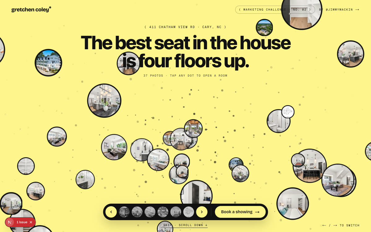
- A headline that flips what people expect about the home. Mine was: "The best seat in the house is four floors up."
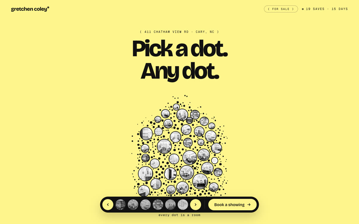
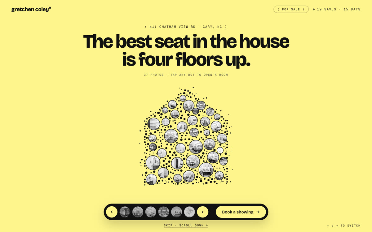
- Draw the house out of dots. Every photo is a round dot. Fill the gaps with small black dots, and put a row of dots on the outline so the roof looks sharp.
- On load, the photos start big and scattered across the whole screen, in color. Then they glide together into the house shape and turn black and white.
- Tap any dot and the photo grows out of that dot into a big card. Tap outside and it shrinks back.
- A black pill bar at the bottom: back and next arrows, 6 round room picks, and one "Book a showing" button.

BELOW THE HERO
- A black ticker that scrolls the facts.
- "Four floors. One for [mornings / dinner / sleep / sunsets]." with the last word rolling.
- One section per floor, each with one small thing that moves.
- Neighborhood "passes": a stack of cards you click through, one real place per card.

THE ASK (only one on the page)
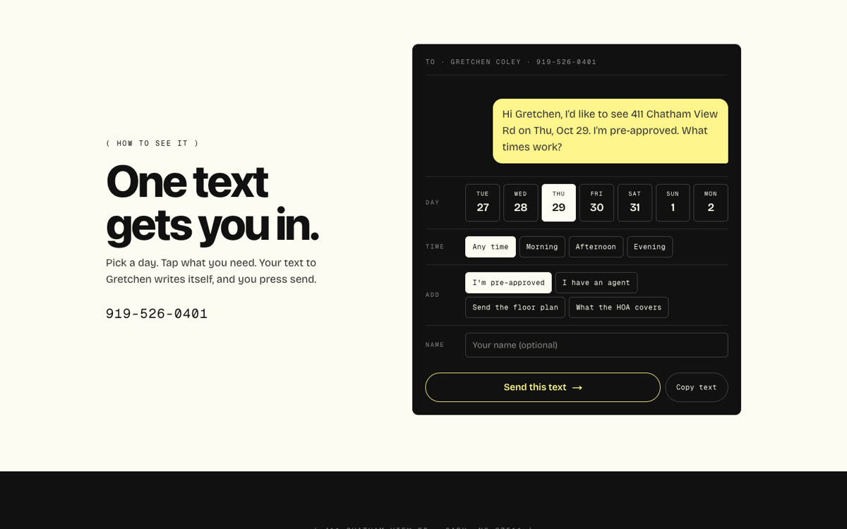
- A dark card that looks like a text message. The buyer taps a day, a time, and extras like "I'm pre-approved", plus their name. The text writes itself. "Send this text" opens Messages to my cell.

RULES
- Real facts and real photos only. Never invent a number or a feature.
- Plain, short words. No em dashes.
- Phone first. One HTML file I can open right away.
How it got built.
Every version, the prompt I gave, and what changed. Newest at the bottom.
v1
Oct 25, 2026
The dot house
“Take the dot grid from cloudstudio.es and make it about one real home. Every dot is one of the 37 listing photos, placed in the shape of the house. Tap a dot and the photo grows out of it. No stock photos, no filler.”@jimmymackin
Took the idea from cloudstudio.es and made the dots the 37 real photos, in the shape of the house.
Tap a dot and the photo grows out of it.
Yellow, cream and black. One black photo bar at the bottom.
v2
Oct 25, 2026
The luxury test
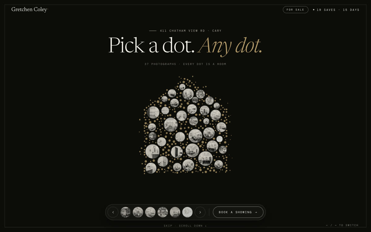
“Push it toward luxury. Same layout, same dots. Show me the high end version so we can see where the line is.”@jimmymackin
Gold on black, an italic serif and thin frames on everything.
Too much. It looked like a template. Kept v1 and took one lesson: holding back is what feels expensive.
v3
Oct 25, 2026
Less bubbly, a better headline
“Go back to v1 and take out 20% of everything: fewer round corners, one accent, tighter margins. Then write a headline that flips what a buyer expects. No cute lines about dots.”@jimmymackin
One accent color, small corners, calmer motion, tighter spacing.
New headline: “The best seat in the house is four floors up.”
v4
Oct 25, 2026
One text gets you in
“Cut the three “how to see it” steps. Steps are a promise. A tool is proof. Give the buyer one thing that works: pick a day and a time, and the text to the agent writes itself.”@jimmymackin
Replaced three empty “steps” boxes with one working tool.
Pick a day and time, tap extras. The text to the agent writes itself, and Send opens Messages.
One ask on the whole page.
v5
Oct 25, 2026
Live, with the fly-in
“Ship it. Before it goes out, add one moment people will screen record: the photos start scattered across the whole page in color, then glide into the house and turn black and white.”@jimmymackin
Shipped to listingleads.com.
The photos now start scattered across the screen in color and glide into the house.
Share picture, phone fixes, and no pop-up on top of the page.
How we checked it.
19 automatic tests on the logic: the dot house, the text message, the dates, the pass stack.
Tapped through as a logged-out visitor on a phone and a desktop: photos open, arrows switch, the text writes itself.